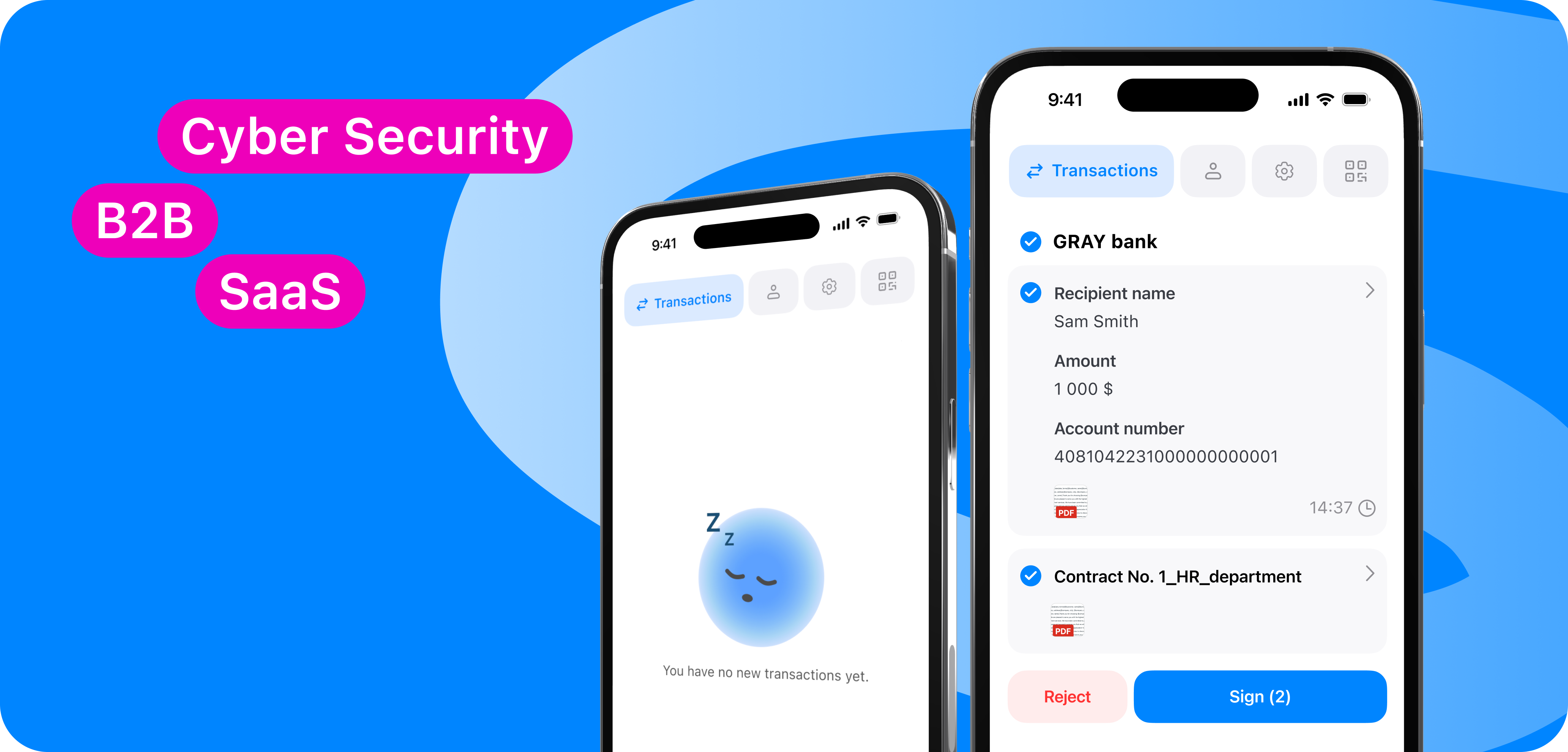
Secure High-Stakes 🔑
Digital Signature Platform
Company
SFERRA, SafeTech
Team
Senior Product Designer (me)
Frontend Engineers
Backend Engineers
QA Engineers
Scope
Fintech App structure, cryptographic key management, and enterprise navigation overhaul
Cross-functional partners
Product Manager
Compliance / Legal
Banking Stakeholders
UX Researcher
At SFERRA, I worked on making digital transactions secure and effortless, redesigning the Finance App's end-to-end structure and navigation to streamline electronic signatures and simplify transaction verification for leading banking integrations.
Outcome
+45% Signing Speed
Streamlined the end-to-end flow so bank employees and clients can verify transactions and sign documents in just two clicks, drastically reducing operational drop-offs.
100% Integration Success
Designed a modular component system and a top tabbar that allowed partner banks to easily embed the service into their ecosystems without any native UX conflicts.
2.5x Client Growth
Boosted interface stability and transparency, which increased user loyalty, helped attract major enterprise clients, and secured external investor funding.
Strategy: scaling enterprise fintech adoption
To transform our Finance App into a highly scalable B2B digital service, SFERRA focused on securing integrations with leading partner banks. The business goal was to turn a complex, technical internal utility into a stable, high-performance product capable of driving client acquisition and securing external investor backing.
Problem: A chaotic product built by engineers for engineers
Previously, the app suffered from an unstable design characterized by structural chaos and a complete lack of a systematic approach. Severe UX flaws and confusing navigation led to frequent operational errors, high user anxiety, and heavily slowed down workflows for bank employees.
Behavioral signals from usability research
To navigate the complexity of the legacy code and interface, I combined thorough technical research with hands-on experimentation in Figma. I conducted deep user interviews and usability tests directly with real users and bank employees. This field data allowed us to identify critical cognitive friction points and systematically eliminate weak steps in the operation process.

Solution: Streamlined transaction funnel
Long-term adoption depended on making a highly secure process feel entirely effortless. I structured the new solution around complete transparency and speed:
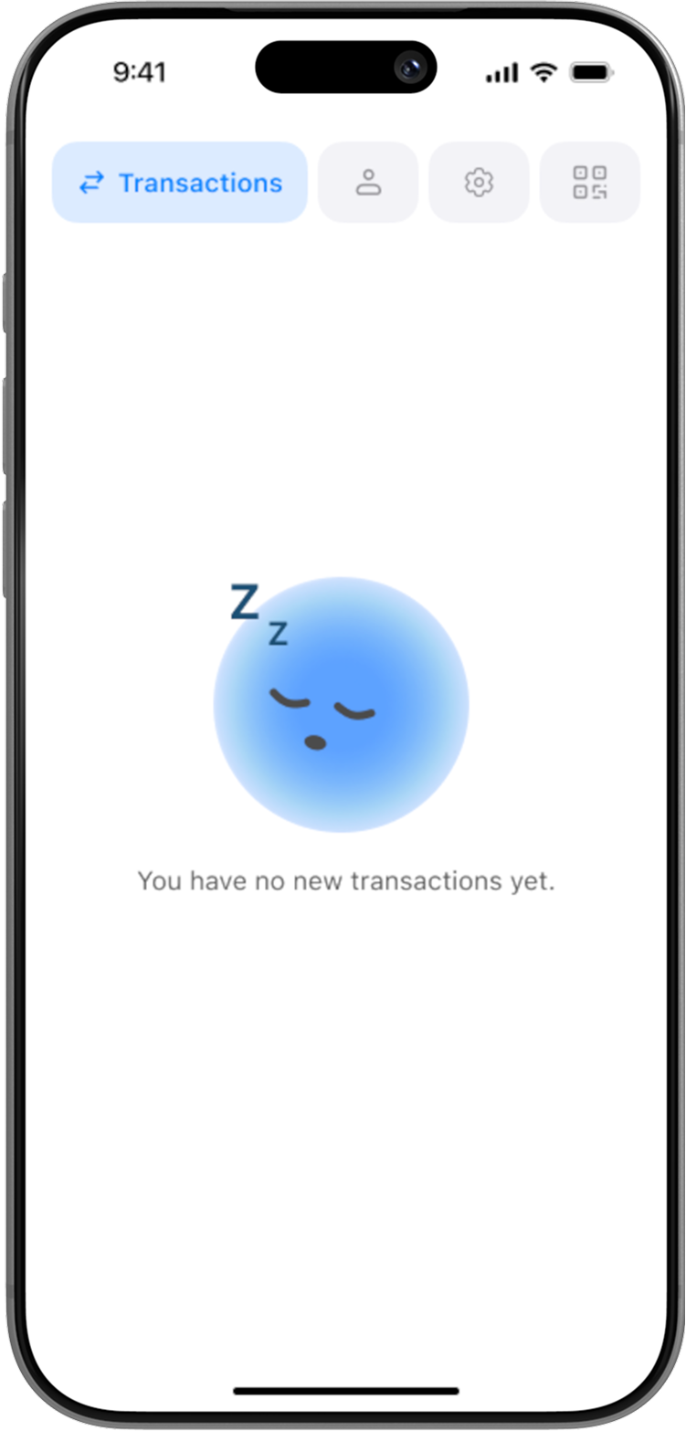
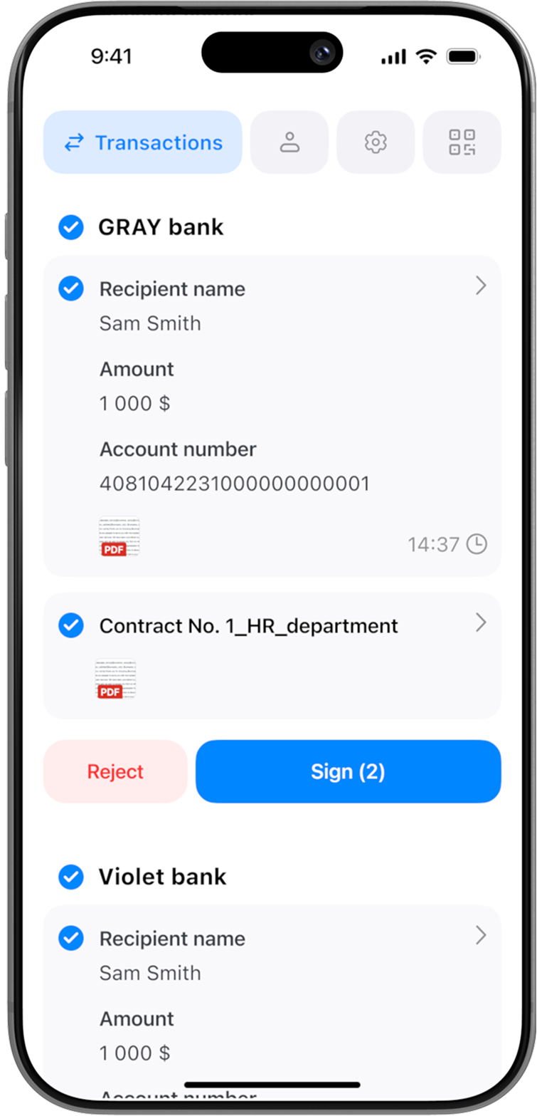
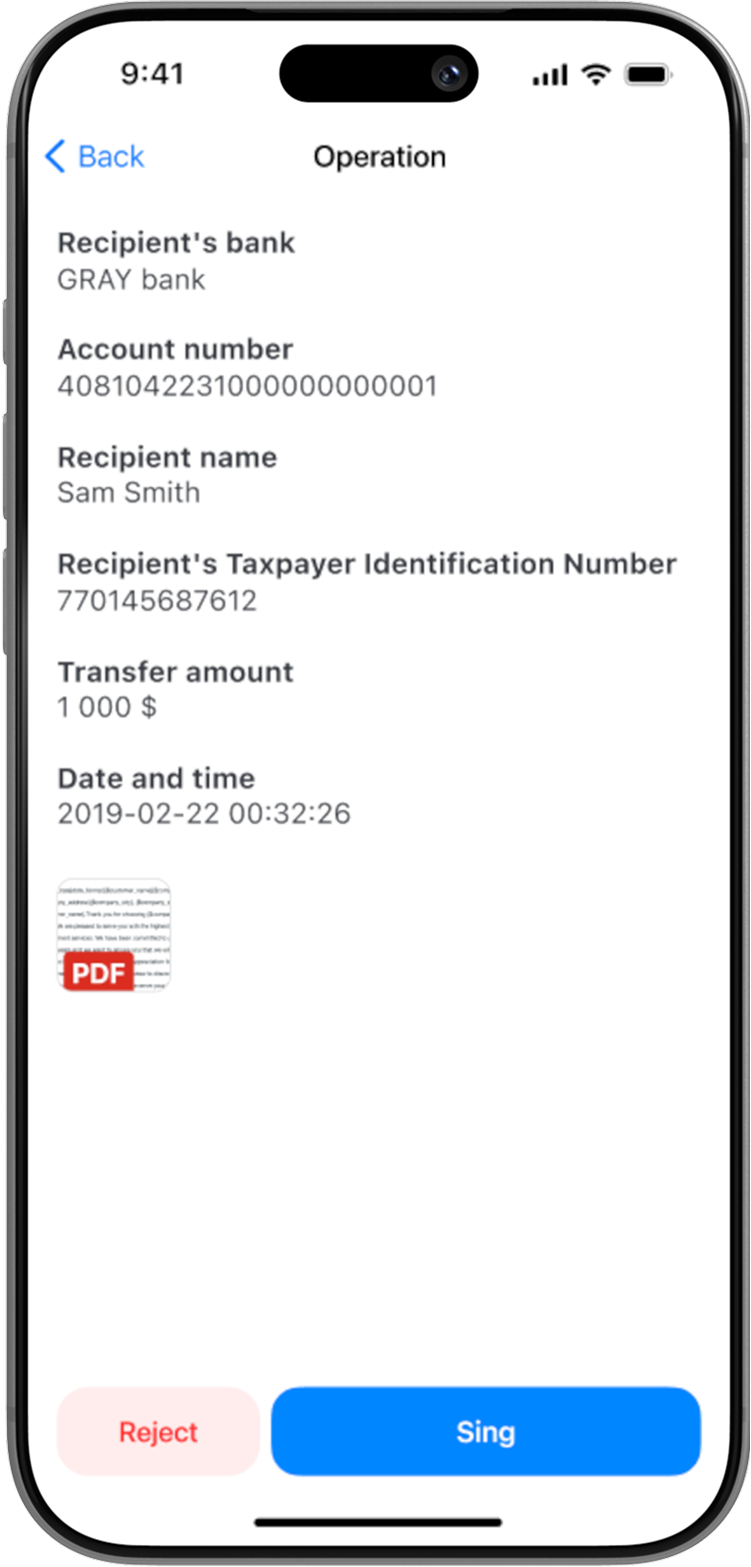
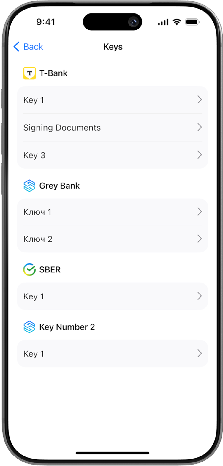
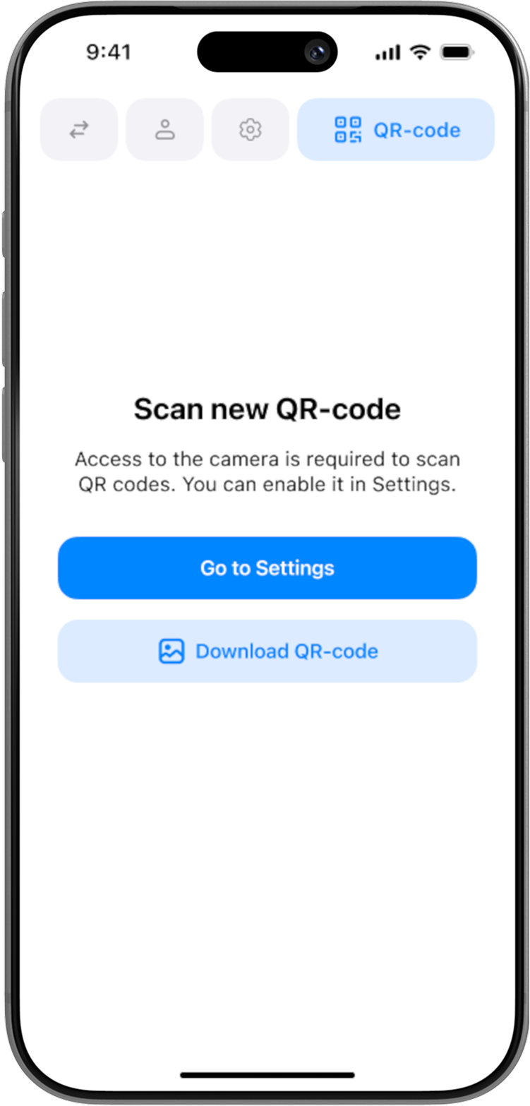
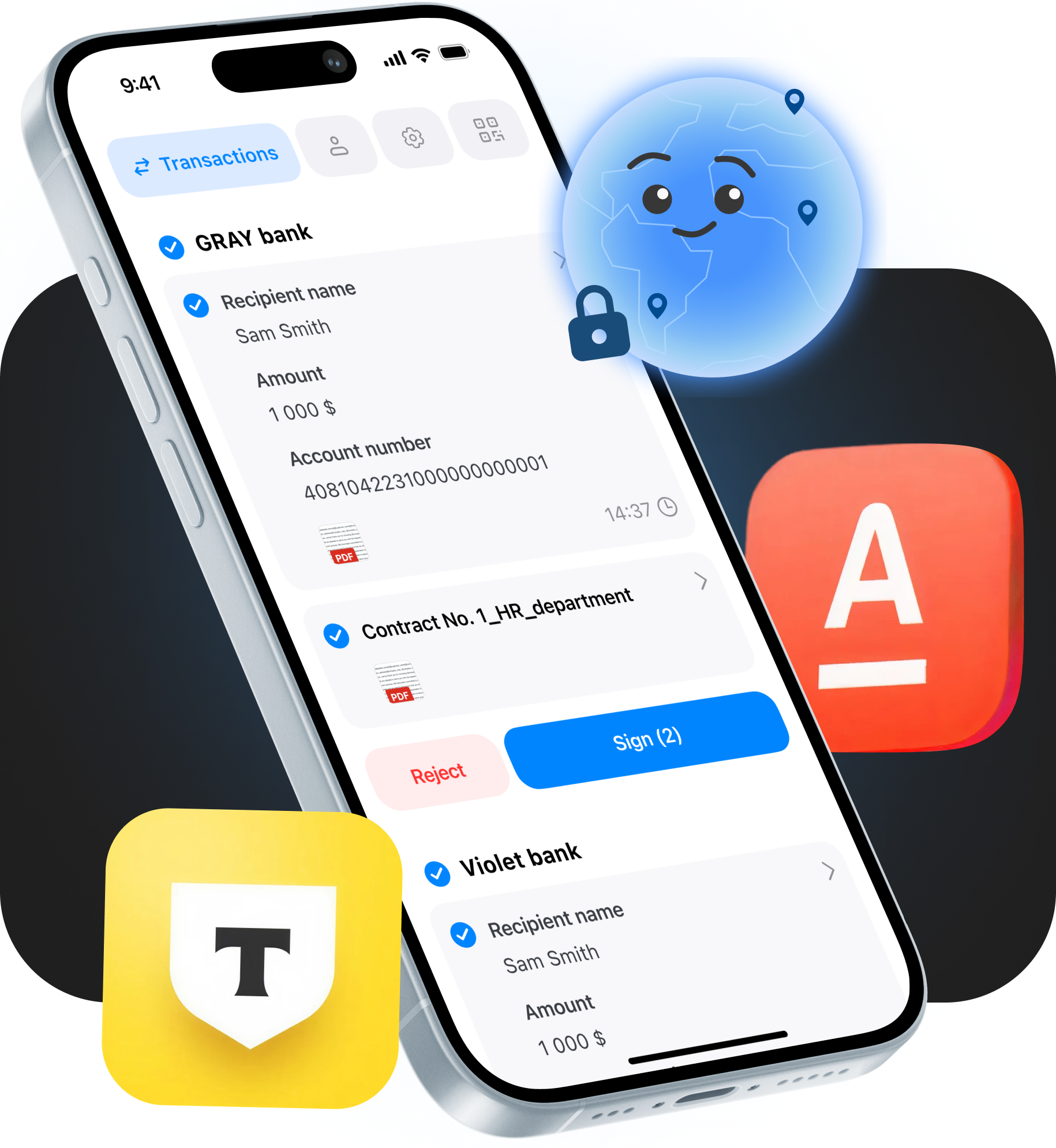
Uncluttered Main Screen
All active transactions are displayed immediately upon opening, allowing users to verify details and sign documents instantly from the first page.
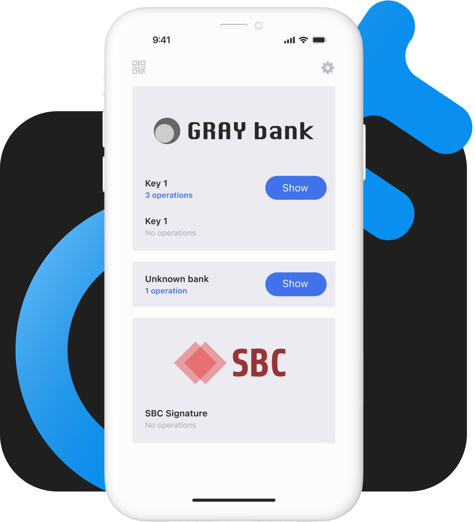
Clean Information Architecture
Advanced key operations (viewing, deleting, changing passwords) were moved out of sight into profile settings to protect everyday users from cognitive overload.
Context-Aware Navigation
Consolidated all major functions into a top tab bar. This ensures clean navigation within the product while completely preventing interaction conflicts with partner banks' native bottom bars.
Product hack: QR-powered automated cryptographic flows
Instead of forcing administrators and users through a tedious manual setup, the system automatically generates secure cryptographic keys in just a few simple steps, establishing robust security from the very first interaction.
To bridge the gap between ironclad security and extreme user-friendliness, I designed a dedicated registration process featuring a unique QR-code key generation system.

Learnings
User-centric over engineer-centric:
Translating purely technical functionality into an intuitive user-centric interface drastically minimizes human error and unlocks enterprise business value.
Design for the parent ecosystem:
When designing a service meant to be integrated into external banking applications, navigation must respect the existing UX boundaries of the host apps (e.g., utilizing a top tab bar).
Validation stabilizes chaos:
Blending rapid design iterations with direct feedback from internal stakeholders is the fastest way to turn an unstable, chaotic legacy system into a resilient product.
Next Cases
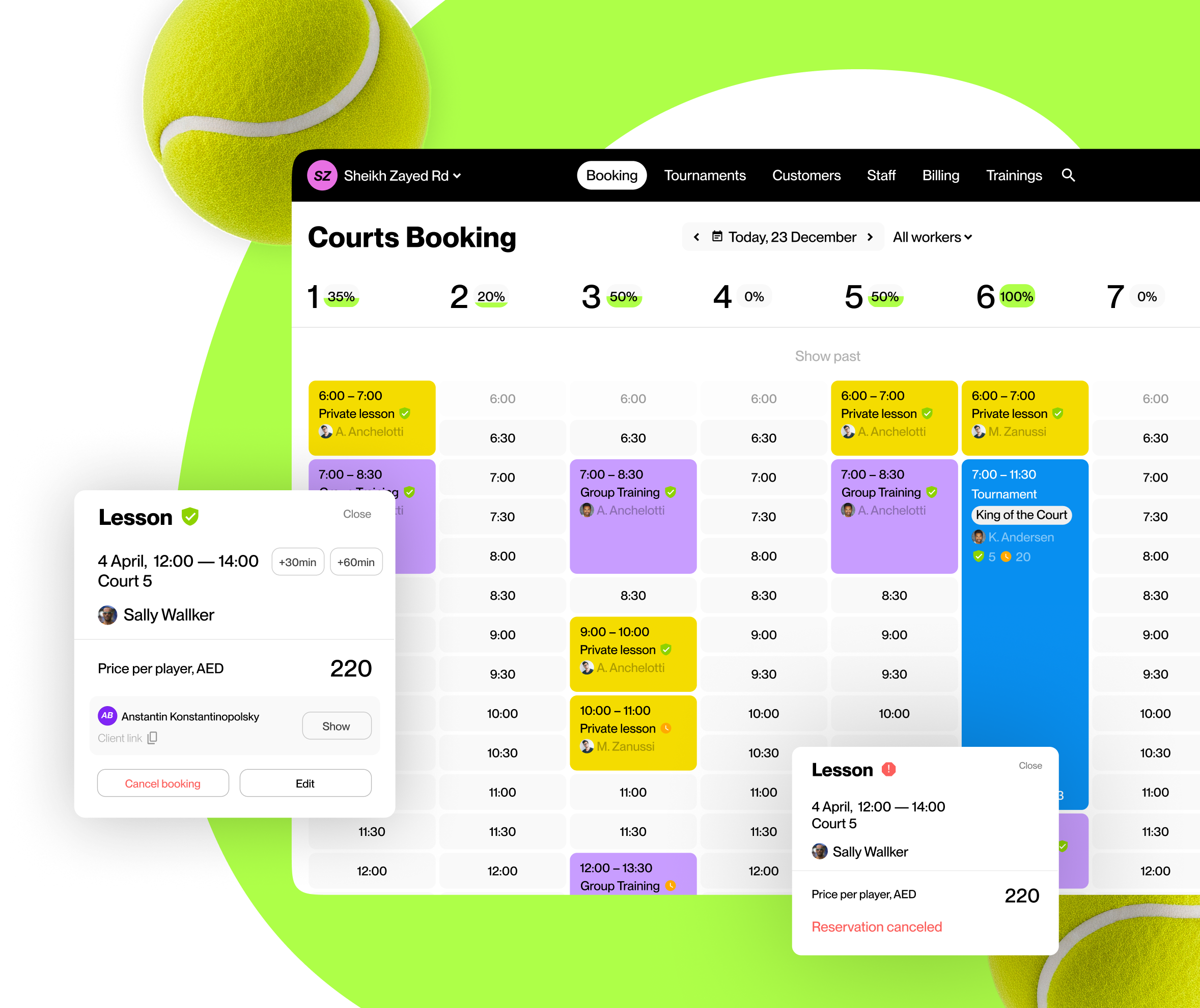
Scalable Dual-Sided
Sports-Tech Ecosystem
Architected a comprehensive digital platform for the padel industry from scratch. Connecting thousands of players via a seamless B2C booking app while streamlining B2B club operations and tournament management.
Role
Product Designer
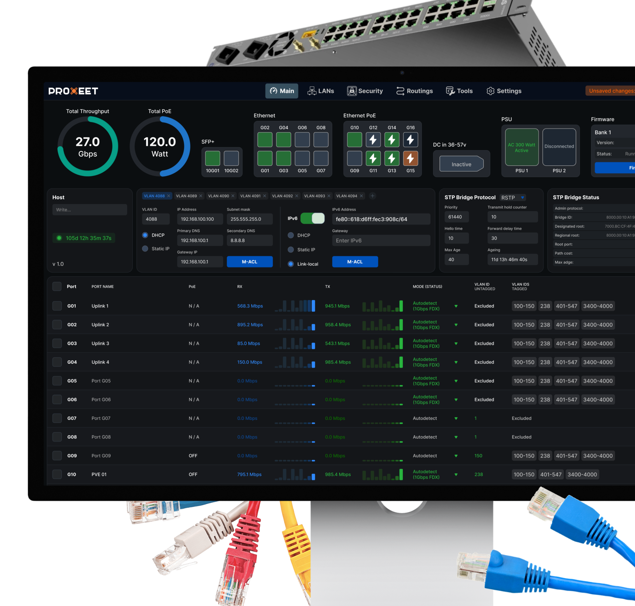
Modernizing Legacy
Network Infrastructure
Led the 0→1 design of a high-load open-source monitoring ecosystem. Replaced 15 years of technical debt with a scalable, data-rich platform for engineering experts and global infrastructure management.
Role
Lead Product Designer